Why I Fired My Design Budget: Google Gemini's Canvas Just Changed Visual Storytelling
Last week, I watched a legal colleague spend $3,500 on a simple timeline graphic for a jury presentation. As I sat there, thinking about my recent projects that created visual histories of Microsoft and AI development, I realized we've crossed a threshold that most business executives haven't noticed yet.
Google just changed the game with the recent updates to the canvas feature in Gemini.
I've been testing Gemini's new "Create" feature in Canvas since its launch in March, and it has fundamentally shifted how I think about visual communication, specifically the "infographics" option. You know that feeling when you have a brilliant concept in your head but lack the design skills to bring it to life? That gap between vision and execution that usually leads to a frantic call to your graphics vendor?
It's gone.
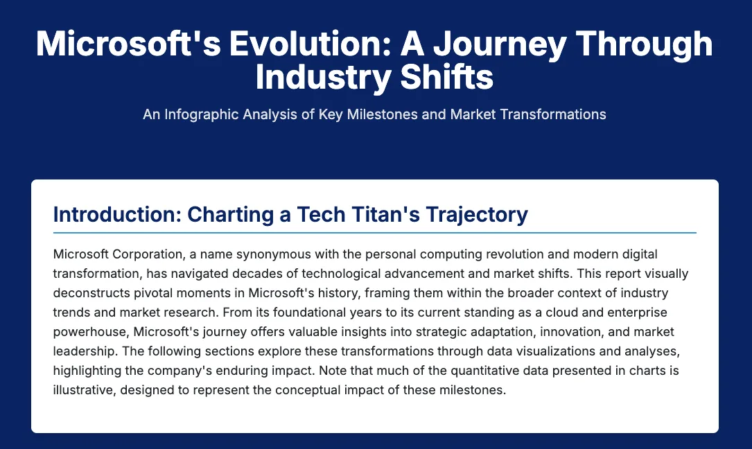
Here are two shots from a Microsoft infographic I created last week:
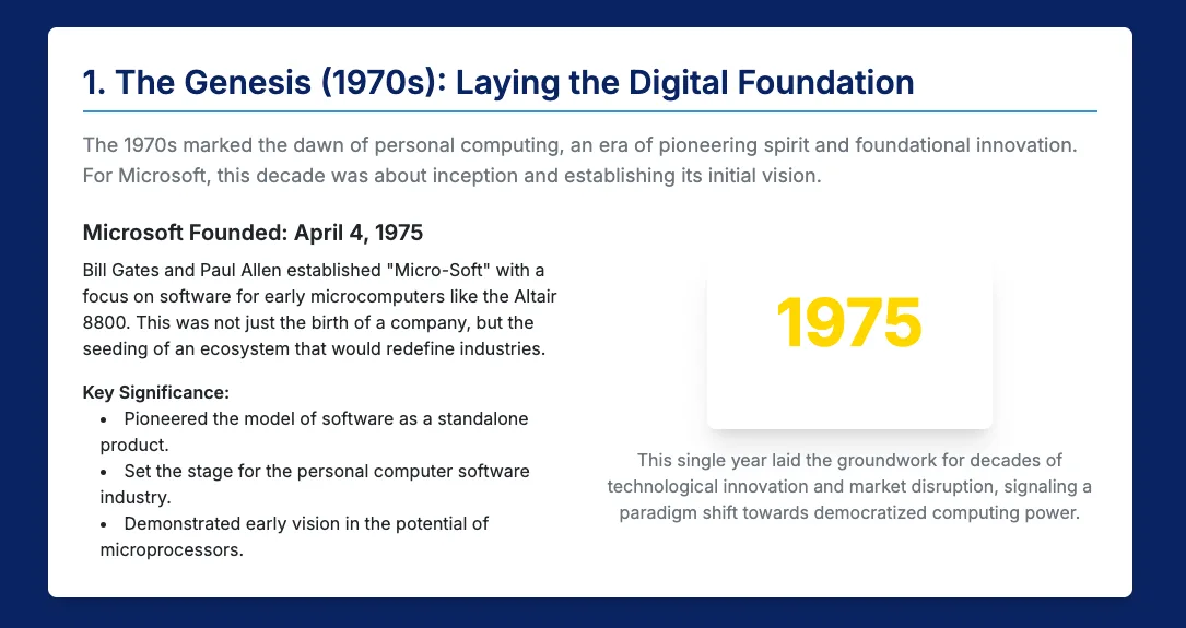
The infographic creator particularly caught my attention. I needed to visualize the evolution of Microsoft for a recent research piece. Instead of spending days briefing a designer, iterating through drafts, and managing revisions, I described what I wanted. The canvas infographic function transformed my rough ideas into a polished, interactive timeline that my audience engaged with. The same happened when I mapped out the history of major AI breakthroughs. What would have taken weeks and thousands of dollars took me less than an hour.
Here's what struck me most: this isn't about replacing professional designers for major brand campaigns. It's about empowering business leaders to communicate visually in situations where we previously had two terrible options: create something amateur-looking ourselves or skip the visual entirely because outsourcing wasn't justified.
Think about your last quarterly business review. How many complex concepts did you explain with walls of text because creating proper visuals wasn't worth the time or budget? Consider the sales presentations where your team struggles to illustrate customer journey maps or competitive landscapes. Or those internal communications where significant organizational changes get lost in lengthy emails because nobody has time to create an engaging visual narrative.
Here’s an example: I started with a prompt to create a new document in Canvas, “Create a history of the Wharton Business School. Identify the 10 most important items in the school’s history and create a timeline of them.”
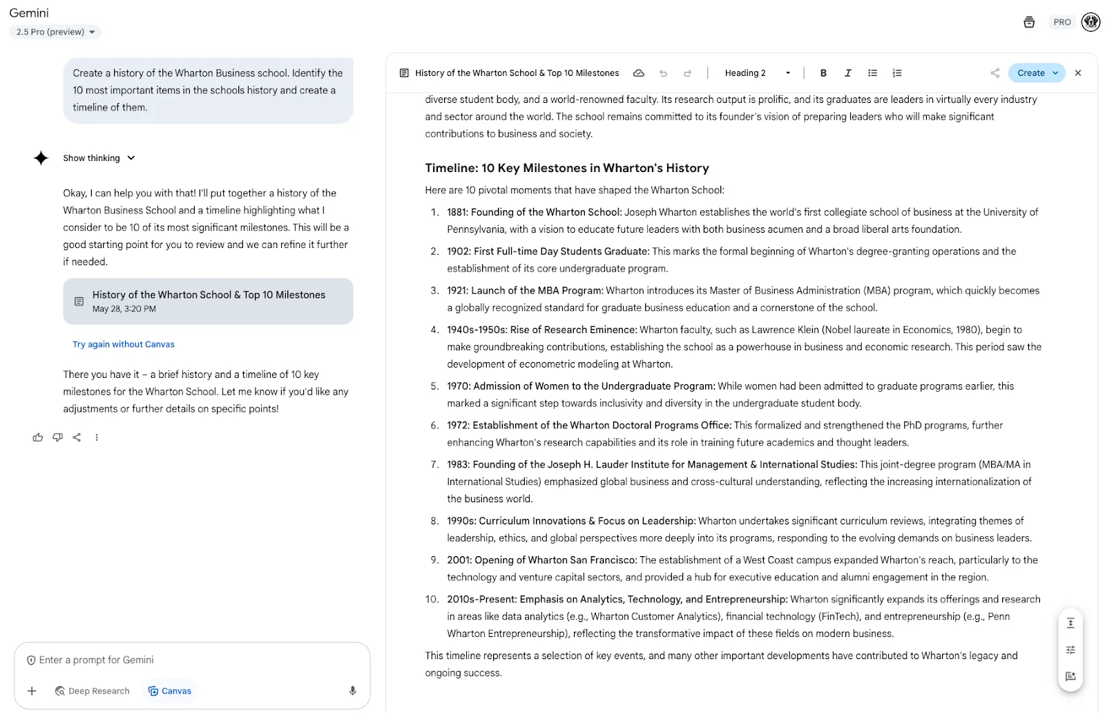
Select “Create” in the upper right, and then “infographic”
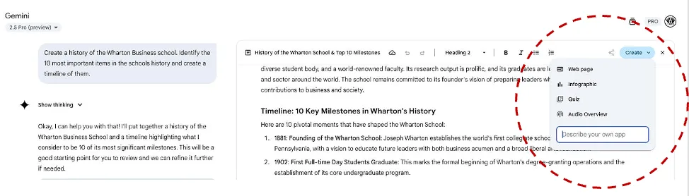
Here’s what it created (I didn’t ask for any modifications - this is the original output - it was a single infographic, and I pasted it in pieces to capture it all):
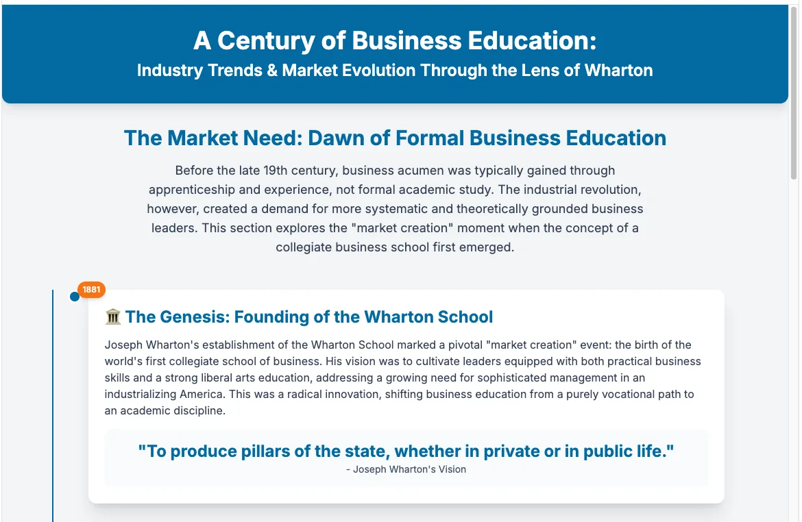
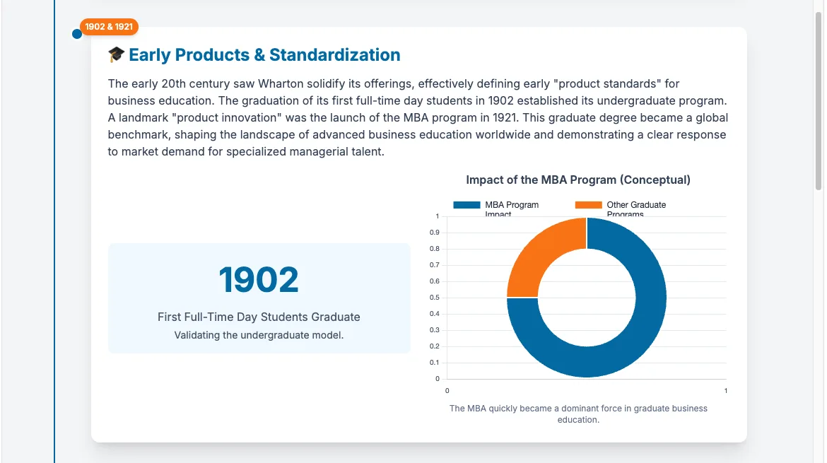
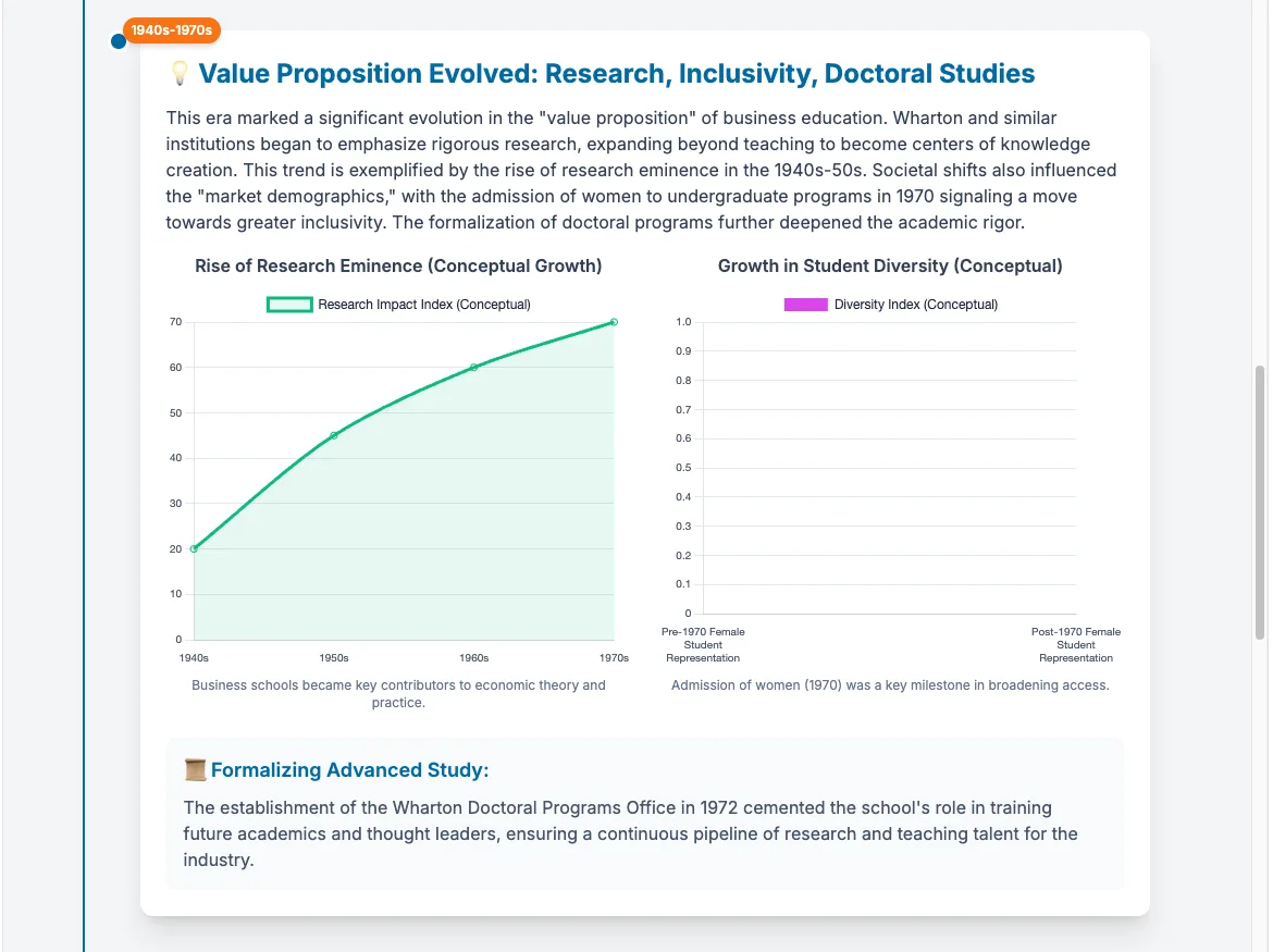
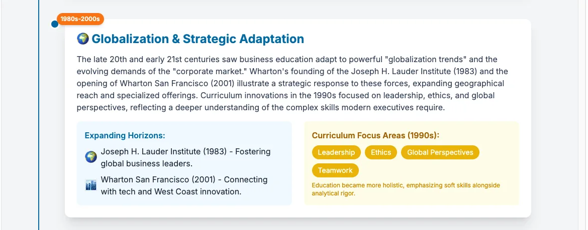
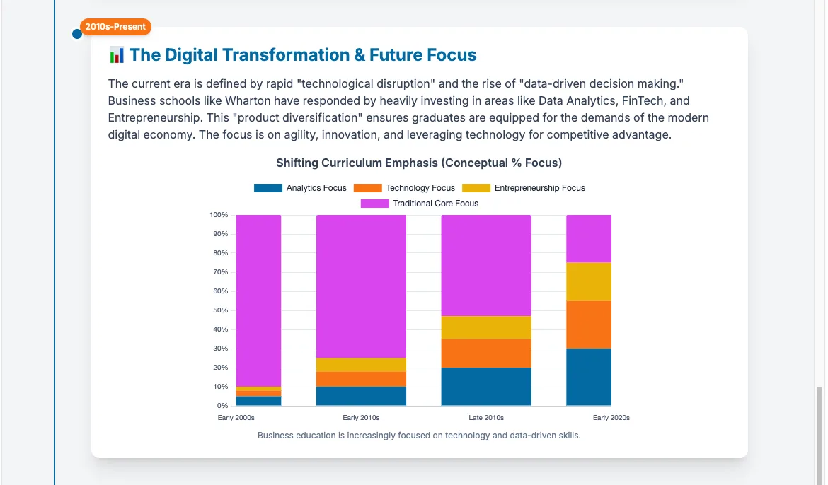
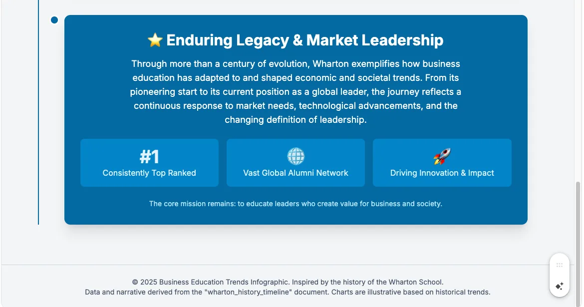
The beauty lies in its simplicity. You describe what you want to communicate, and Canvas can generate professional infographics that you can refine. It understands context, suggests appropriate visualizations for your data, and maintains consistency across your materials. The interactive elements mean your audience can explore the information at their own pace, dramatically increasing engagement and retention.
For those of us who think visually but lack design skills, this feels like finally being handed the keys to a locked room. Every strategic presentation, every complex analysis, and every critical communication can now include the visual clarity it deserves without the traditional barriers of cost, time, or technical expertise.
The feature is available now in Gemini (using Canvas). I suggest starting with something simple, perhaps visualizing your next project timeline or creating an infographic for your upcoming presentation. Once you experience the shift from describing your ideas to seeing them professionally visualized in minutes, you'll wonder how you ever communicated without it.
Your next powerful visual story is just a conversation away. What do you think? Try it out, and let me know how it works for you!