Stop Debating Your Dashboard - Prototype It in Two Hours

If you lead a SaaS business, you don’t have weeks to argue over which metrics belong on the front page. You need a working model you can react to, then you need it wired to data. Large language models are finally good at giving you that first part in hours, not days.
Here’s what I tested. I fed the same prompt to ChatGPT, Claude, and Gemini, asking for a Series A executive dashboard, plus weekly views for the RevOps SVP and an enterprise AE. I asked for formulas, professional styling, and a working mockup in HTML or React. Then I compared the results and took screenshots.
This was the basic prompt I used (note that I did hide a few of the specific details about the company):
“I’m working with a b2b SaaS company and need to create an executive dashboard for the most important metrics. Think about what they are for a series A company, then think through what the executive team needs to see weekly, as well as what the SVP of RevOps, and a typical enterprise AE (Account Executive) needs to see weekly and put together a comprehensive list of metrics with formulas and create a mock dashboard showing what it would like like. Be as thorough as possible. Make the dashboard extremely professional looking with traditional corporate colors. Create it in HTML or React and show it in the canvas window.”
What worked, and who won
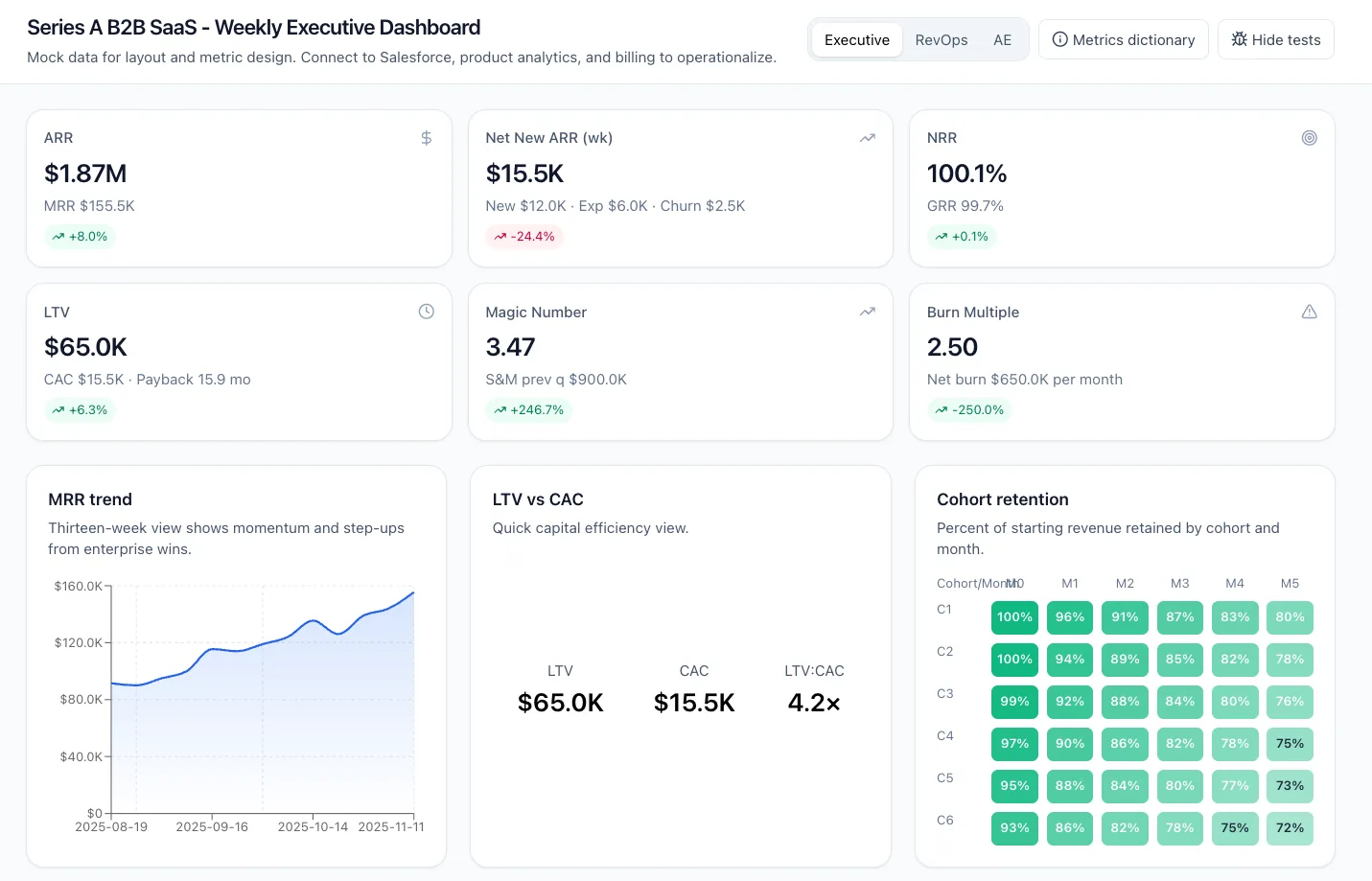
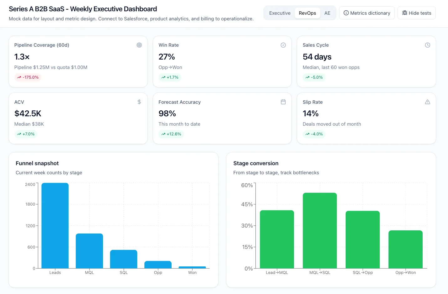
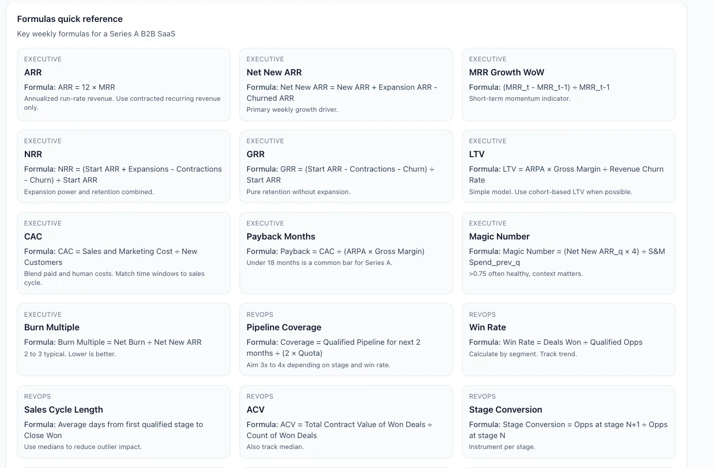
ChatGPT set the pace. It produced a full multi-card executive view with ARR, Net New ARR, NRR, LTV, Magic Number, and Burn Multiple, plus a cohort-retention heatmap, an MRR trend chart, pipeline by stage, and activity widgets. It even added a “dev test” panel that checks core math and a quick metrics dictionary with formulas. The layout looked client-ready and the structure made sense to an operator. This is what you want from a prototype, clarity and coverage you can react to.
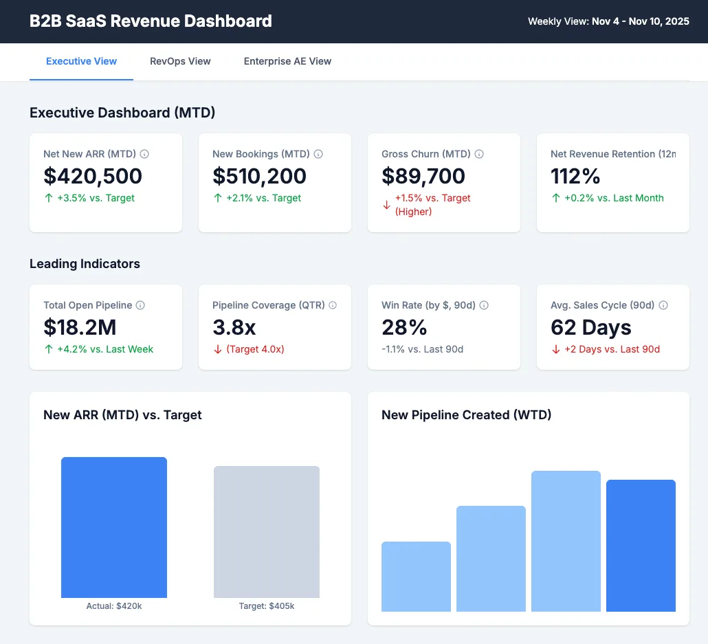
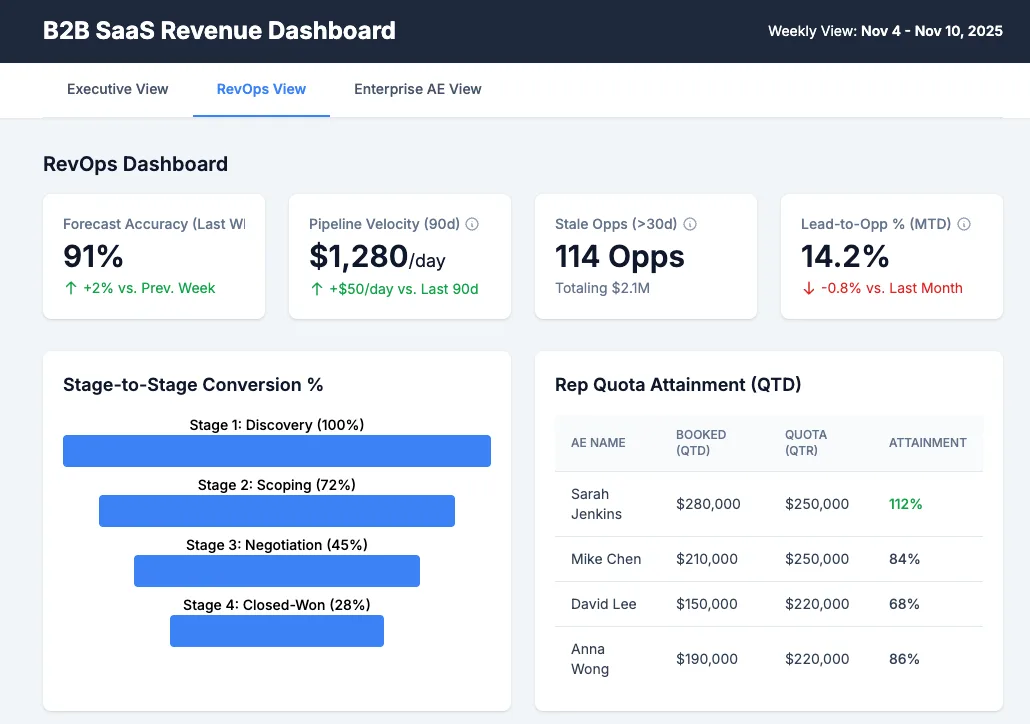
Gemini landed in the middle, and that is progress. It generated a clean single-file dashboard with tabs for Executive, RevOps, and AE. The cards were well-chosen, charts were rendered, and the look matched a standard corporate palette. Gemini often lags in visual build quality. Not here. I expect a bigger jump when the next release ships (Gemini 3 - hopefully in the next few weeks!), and this run already shows it can get you to a usable mock quickly.
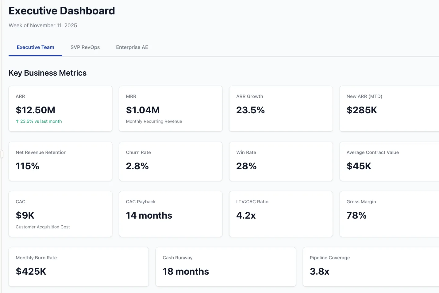
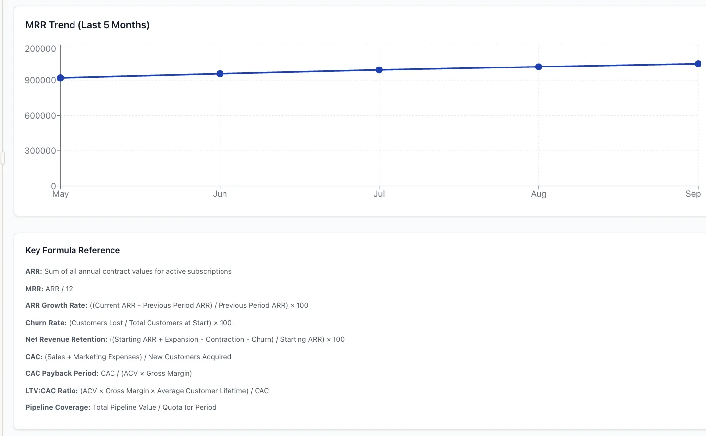
Claude underdelivered in this run. Claude usually shines at structured writing and UI scaffolds. This time, the output was plain. It covered the basics, added a simple line chart and formulas, but lacked energy and invention. Useful as a checklist, not as a board-level mock.
Why this matters
Prototyping dashboards with LLMs changes the meeting. Instead of debating hypotheticals, you react to a concrete design, complete with formulas and example numbers. That speeds alignment, exposes disagreements on definitions, and forces tradeoffs early. Once the team says “this is it,” you hand the spec to your build environment, or connect the mock to Salesforce and billing.
How to get strong results from any model
Be explicit about personas and time windows. Ask for Executive, RevOps, and AE views, each weekly.
Name the metrics and require formulas. For example, “Net New ARR equals New plus Expansion minus Contraction minus Churn.”
Request sample charts and tables. MRR trend, cohort retention, pipeline by stage, activity by type.
Specify style and format. “Professional, traditional corporate colors, React or single-file HTML.”
Ask for validation. A small panel that checks that ARR equals 12 times MRR, that LTV and CAC math is consistent, and that conversion ratios stay in bounds.
Those five lines turn a generic answer into a working first draft.
Tradeoffs and cautions
Quality varies by prompt and day. My ranking here is one test. You will still see variance, even inside a single tool.
Prototypes are not production. Treat formulas and labels as a starting point. Confirm definitions with finance and RevOps.
Data security matters. Keep real customer data out of public models. Use redacted samples until you connect through an approved environment.
What to do on Monday morning
Run the exact prompt I used, but swap in your company context. Require the three persona views and a formulas section.
Pick the best mock, then mark up the screenshot with edits. What is missing, what is noisy, what should move to page two.
Freeze metric definitions in a one-page spec. ARR, NRR, LTV, CAC, Magic Number, Payback Months, Pipeline Coverage, Stage conversions.
Wire it up. Move the UI into your build tool of choice, then connect Salesforce, product analytics, and billing.
Set a weekly review. The dashboard earns its keep only if leaders use it, and if owners update definitions as the business changes.
My read today, if you want the fastest high-quality prototype, use ChatGPT (with “heavy” thinking if you have access). If you prefer Google’s stack or expect near-term upgrades (Gemini 3!!!), Gemini is now a real option. Claude is still excellent (and honestly, given my past experience with it, this was really disappointing!) for narrative and planning, but in this specific visualization test, it came in last.
The bigger point is simpler. Stop starting with a blank canvas. Start with a working model, then make it yours.
Business leaders are drowning in AI hype but starving for answers about what actually works for their companies. We translate AI complexity into clear, business-specific strategies with proven ROI, so you know exactly what to implement, how to train your team, and what results to expect.
Contact: steve@intelligencebyintent.com