From Text to Timeline: Gemini Canvas Transforms Content into Visual Stories

Have you ever sat down on the couch to write a quick article, and your 120-pound St. Bernard puppy climbed up next to you, put his giant paws in your lap, and said, "play with me?" I can assure you that the struggle is real. Okay, I'm back from a quick walk with the beast (Magnus).
Those of you who have been reading my articles for a while know that I have become a massive fan of the Gemini models (to be fair, I also use ChatGPT and Claude every day, but for different purposes). Not only has Google dramatically improved the overall capabilities of the latest Gemini model (2.5 Pro), but they've also done some impressive things with the Canvas feature.
This article isn't an in-depth tutorial on all things Canvas. I'm currently working on a longer piece that compares Gemini Canvas with ChatGPT Canvas and Claude Artifacts, which I will hopefully publish next week. No, this is around a single new feature in Canvas - the ability to create infographics.
Google launched the new Canvas feature back on March 18, 2025, and it opened up a whole new set of ways to interact with content. On May 20, 2025, they added a new "create" function in Canvas, and one of the options was Infographics.
Throughout my career, I've had numerous consulting projects that required creating infographics to help bring a story to life. Having a tool like this would have saved me, my fellow consultants, and the teams of designers hundreds of hours.
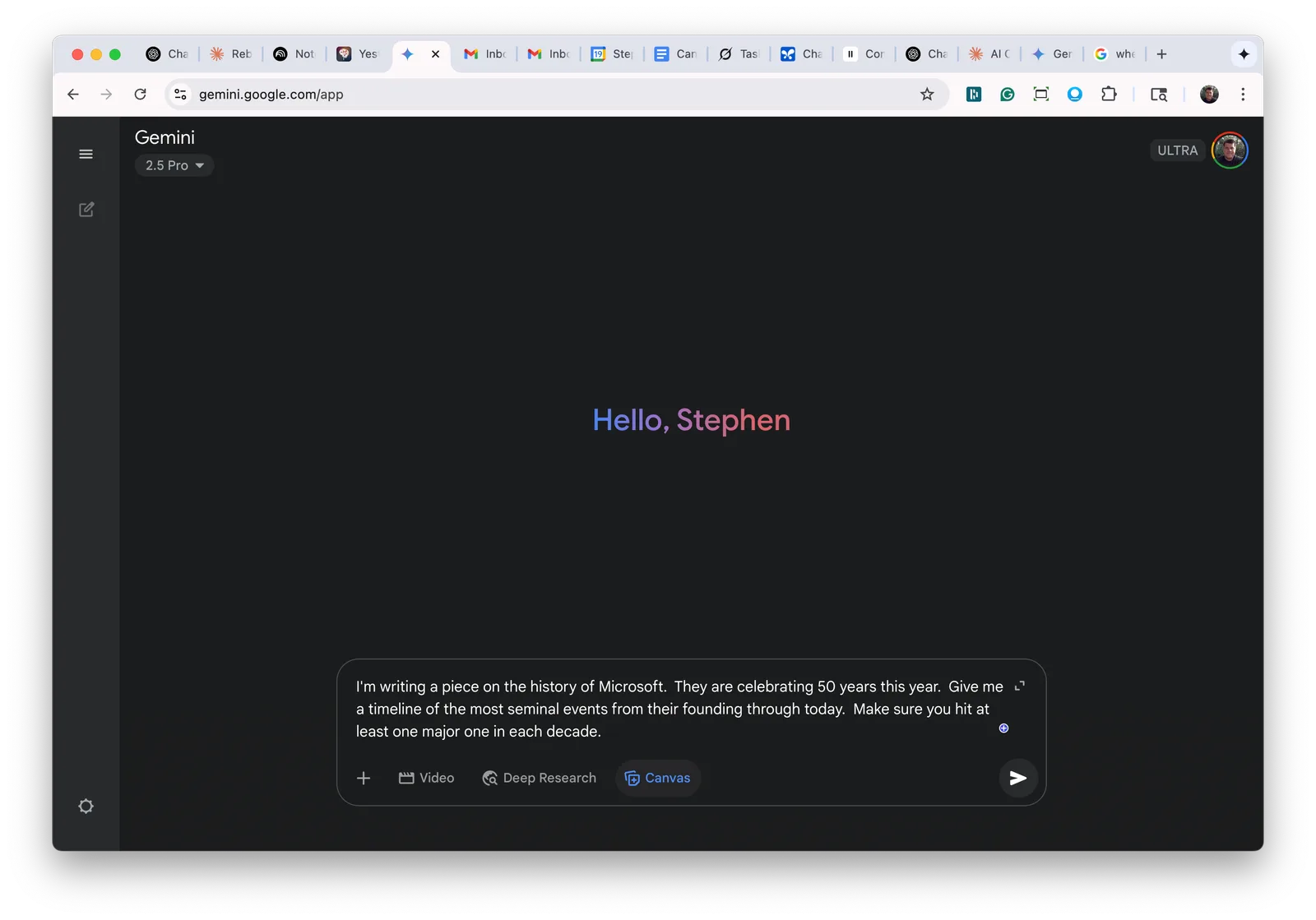
Let me show you how it works. Microsoft recently celebrated its 50-year anniversary this year (an amazing milestone!). Let's say I was writing a piece on the 50-year history, and I wanted to cover the significant milestones in their evolution. I would start by going into Gemini and typing in a prompt like this: "I'm writing a piece on the history of Microsoft. They are celebrating 50 years this year. Give me a timeline of the most seminal events from their founding through today. Make sure you hit at least one major one in each decade." Before hitting "enter" to submit the prompt, I would also click on the canvas window.
What you'll get back a few seconds later is a first draft of the 50-year history in the canvas window. It should look something like this:
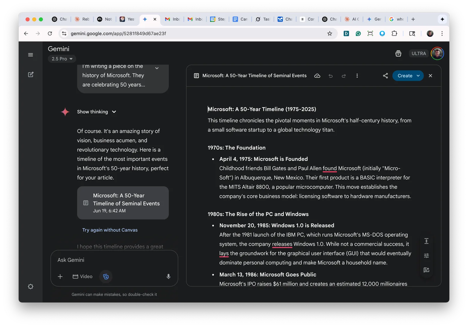
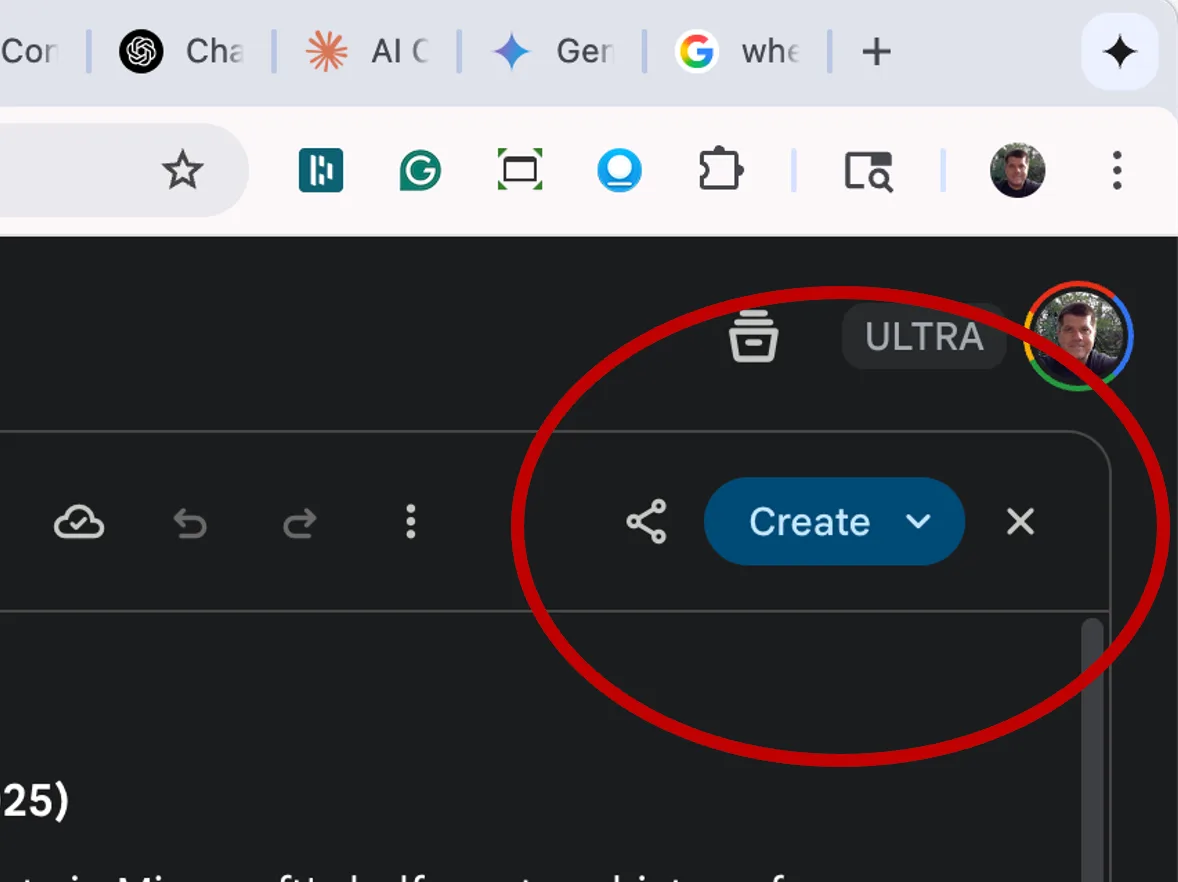
If you look closely at the upper right-hand side of that window, there is a blue button that says "Create".
Hit the indicator to open the menu, and you'll see this list of options:
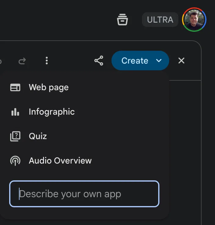
Right there at number two is 'infographic.' Go ahead and press it, and you'll see the canvas window generating HTML code for a minute or two, and then once it is done, it will switch over to 'preview' and show you the infographic. My version looked like this:
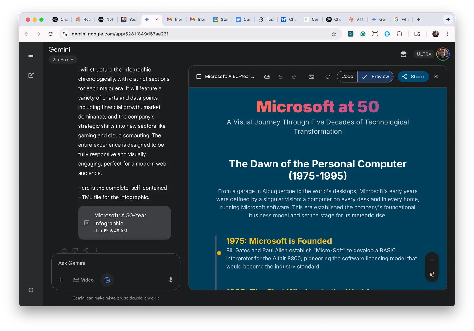
You can now scroll (vertically) through the timeline. If you hit the "share" button in the upper right, you can create a link to share with others, and they can open your timeline in their browser. You can also perform several other useful tasks. You can ask it to change the formatting. For example, maybe you want to apply a different colored background or change the font colors - just ask.
One thing I like is horizontal timelines (as opposed to vertical). When presenting concepts, the visual of moving from left to right is more effective than moving from top to bottom for several reasons. Want to do that? Say, "Make this infographic scroll horizontally instead of vertically." Canvas will work its magic, and you will end up with something like this:
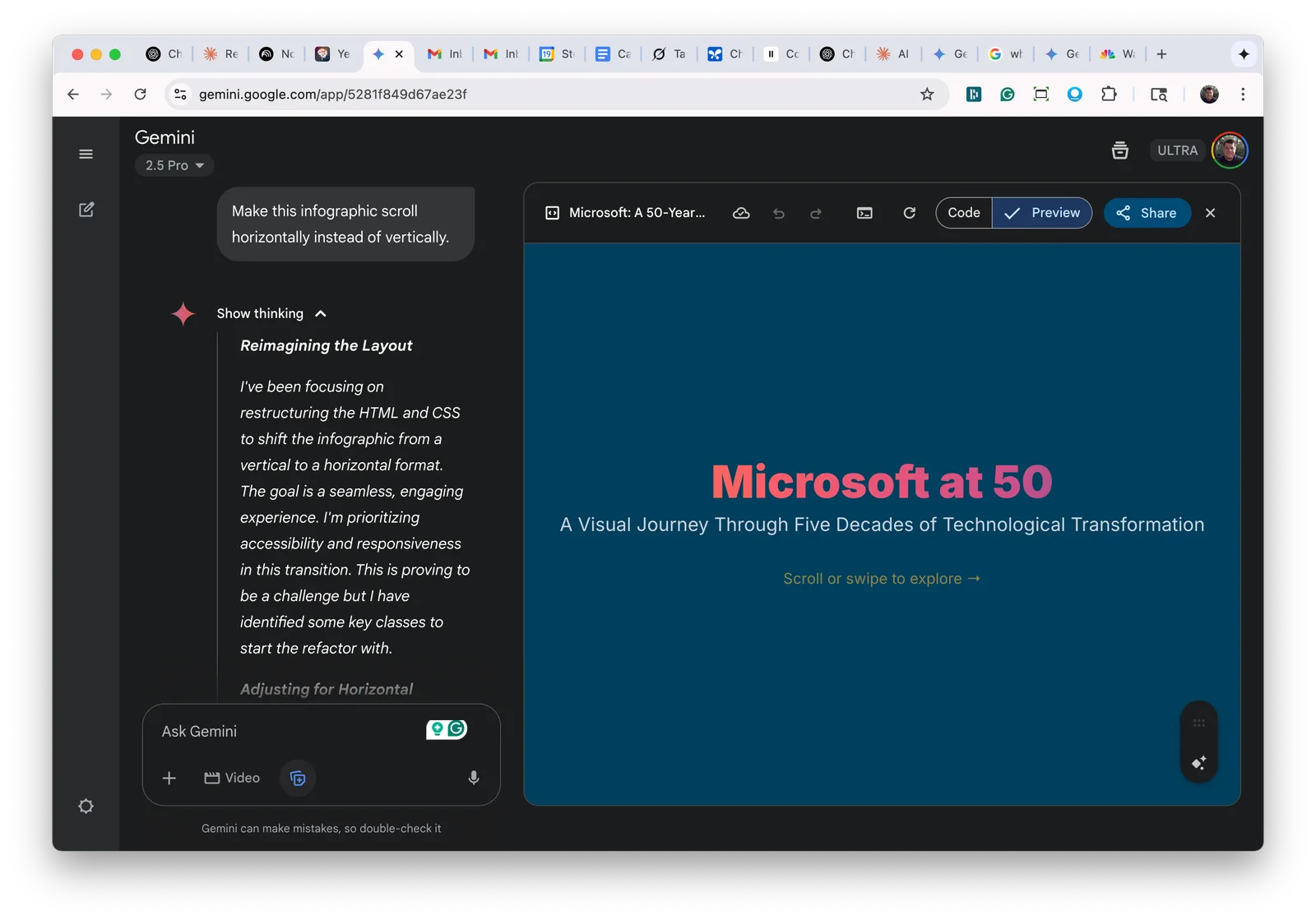
One last helpful tip: if you want to embed this infographic on a web page, you can click the "code" option, copy the entire HTML code, and then use it as needed.
I hope that this was helpful. This is an amazing feature, and a number of my clients have already been using it to create incredible timelines and other useful infographic stories.
If you enjoyed this article, please subscribe to my newsletter and share it with others! Looking for help to really use AI effectively in your organization? Wondering where to start or what tools to use? Reply directly or reach out: steve@revopz.net.